Buttons
Buttons
note
For information on how to use buttons, see How-to Guides - Buttons.
Buttons are interactive components on a Message. Similar to the old-school reaction buttons, these provide cleaner UI/UX than a small reaction button and are the preferred way of handling such inputs now.
Buttons must be inside an ActionRow
caution
You can have up to 5 Buttons within each ActionRow.
Action rows with buttons cannot have select menus.
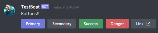
Button Styles
Button styles offer a number of ways for a button to display
| Style | Description |
|---|---|
| PRIMARY | A blurple button |
| SECONDARY | A grey button |
| SUCCESS | A green button |
| DANGER | A red button |
| LINK | A grey button, that navigates to a URL |
caution
LINK style buttons cannot have a custom_id and will not send an interaction event when a user clicks on it.
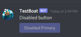
Disabled buttons
Buttons can be disabled to prevent user interaction. When set to disabled the button will appear grayed out.
Emoji Buttons
Buttons can also display an emoji rather than text if desired